This article introduces a method for extracting the main colors from images and classifying them by color harmony. The study itself focuses on what color schemes/harmonies are frequent among popular illustrations. This is not a tutorial so there will be no code snippets, but you can find all the codes to this study in my Github repo.
The Color Harmony Problem
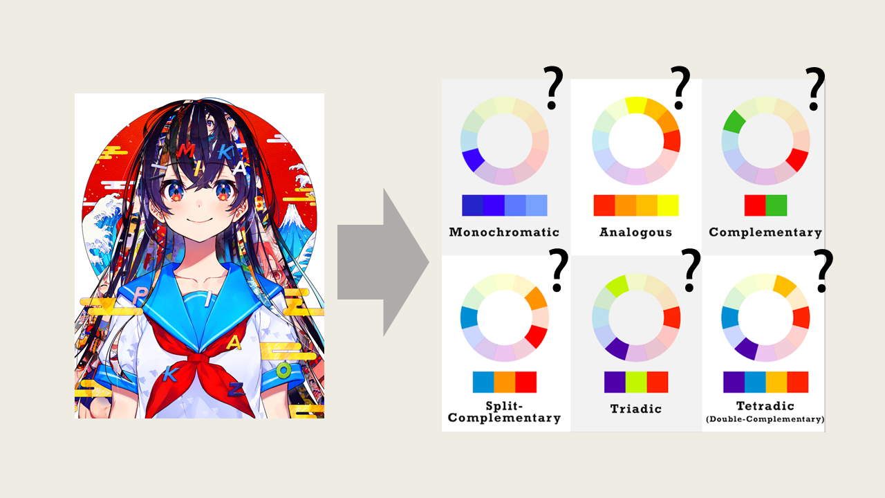
Illustration by Mika Pikazo
In color theory, color harmony refers to the pleasing effect attained by using certain color combinations. Examples include the use of monochromatic (single color), analogous (neighboring colors), and complementary (opposite) colors. It is usually taught that using having these color harmonies will make your pictures more interesting, but there is no research to back this claim nor one that studies which color harmonies are the most commonly used.
In this study, I will introduce a computational approach to extract the ‘main’ colors and identify the existing color harmonies of an image. Out of personal interest, I conducted this study is over popular Japanese-style illustrations.
The dataset of images was gathered from Pixiv, Japan’s top website for digital artists. I gathered the top most 2551 popular illustrations under the ‘Original’ tag (to eliminate any bias from popular characters or series). The data was gathered on June 12th, 2020 using the Powerful Pixiv Downloader Chrome extension.
Color Spaces and Chroma
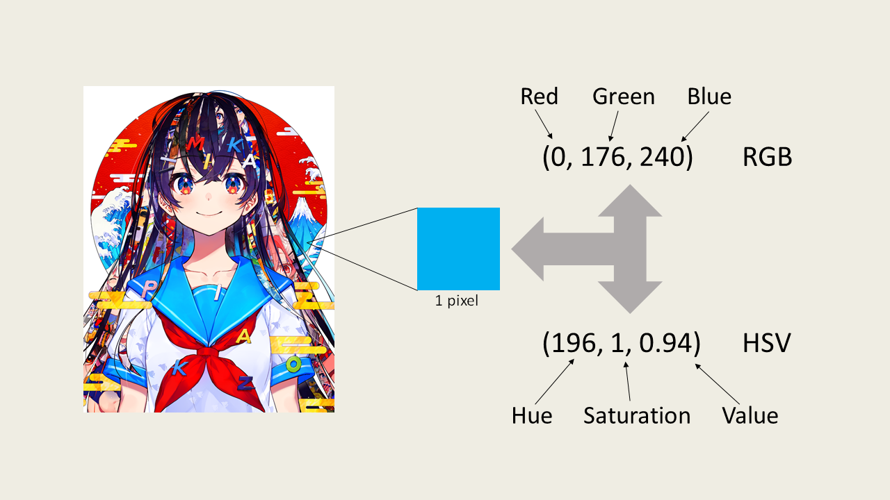
Before we dive into the methodology, let’s define some important vocabulary about color theory. Color spaces can be thought of the different ways we can represent a color. The most common color space, RGB, represents each color as a mixture of red, green, and blue light; each having a value range of 0 to 255; (0, 0, 0) being black and (255, 255, 255) being white.
Another popular color space is the HSV which stands for a color’s hue, saturation, and value. Hue is the baseline color taking a value of 0 to 360 corresponding to the angle on the RGB color wheel (0 being red), saturation is the vibrancy of a color and takes values between 0 and 1 (0 being completely in greyscale), and value representing the brightness of a color (a value of 0 will make the color completely black despite the hue and saturation).
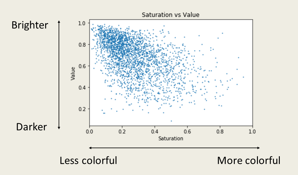
Saturation vs Value
As a straight up first step analysis of color schemes, I plotted the average saturation against the average value of every image in the dataset. The averages are calculated from the saturation and value of all the pixels of the image. Here, we are not interested in the specific color combinations used in each image yet, so we don’t consider the hue. The scatter plot gives us a general idea on the color styles of our dataset.
Chroma vs Value
The problem with the above figure is that the visual difference between high and low saturations will actually be imperceptible at very low values as they will both appear black. Because of this conflict, we prefer to use the notion of chroma, or purity of a color instead of saturation. We can transform the saturation into chroma by multiplying it with the value since it ranges from 0 to 1.
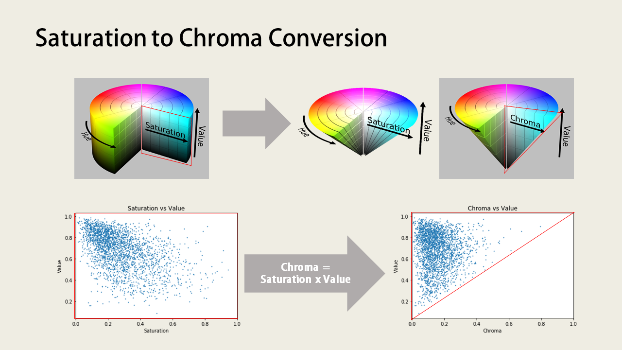
Now plotting the chroma against the value of images in our dataset will give us a more intuitively accurate representation of images based on their brightness and color purity. Light and bright colored images are on the top left, vibrant and strong colors on the top right, and dark images at the bottom left of the plot. We can see that our dataset consists of mostly light and bright colors, this could possibly be the trend for popular illustrations on Pixiv.
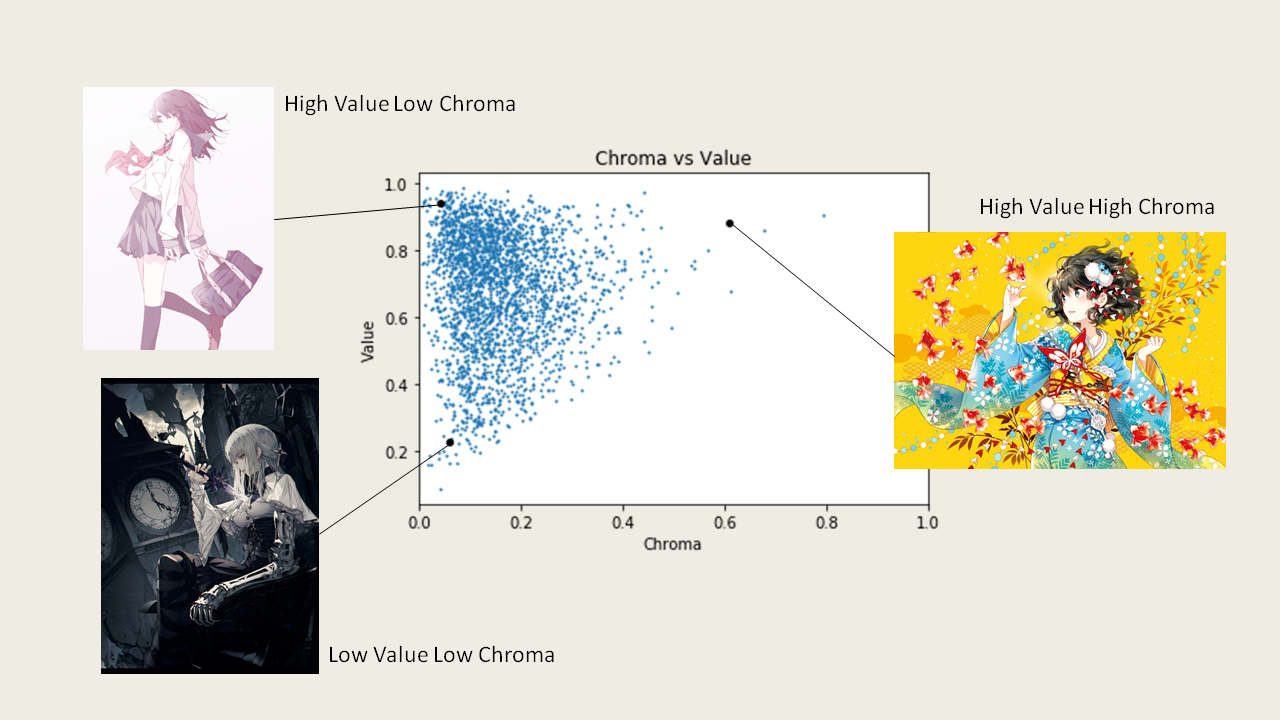
Illustration by shimano (top left), ₩ANKE (bottom left), Nardack (right)
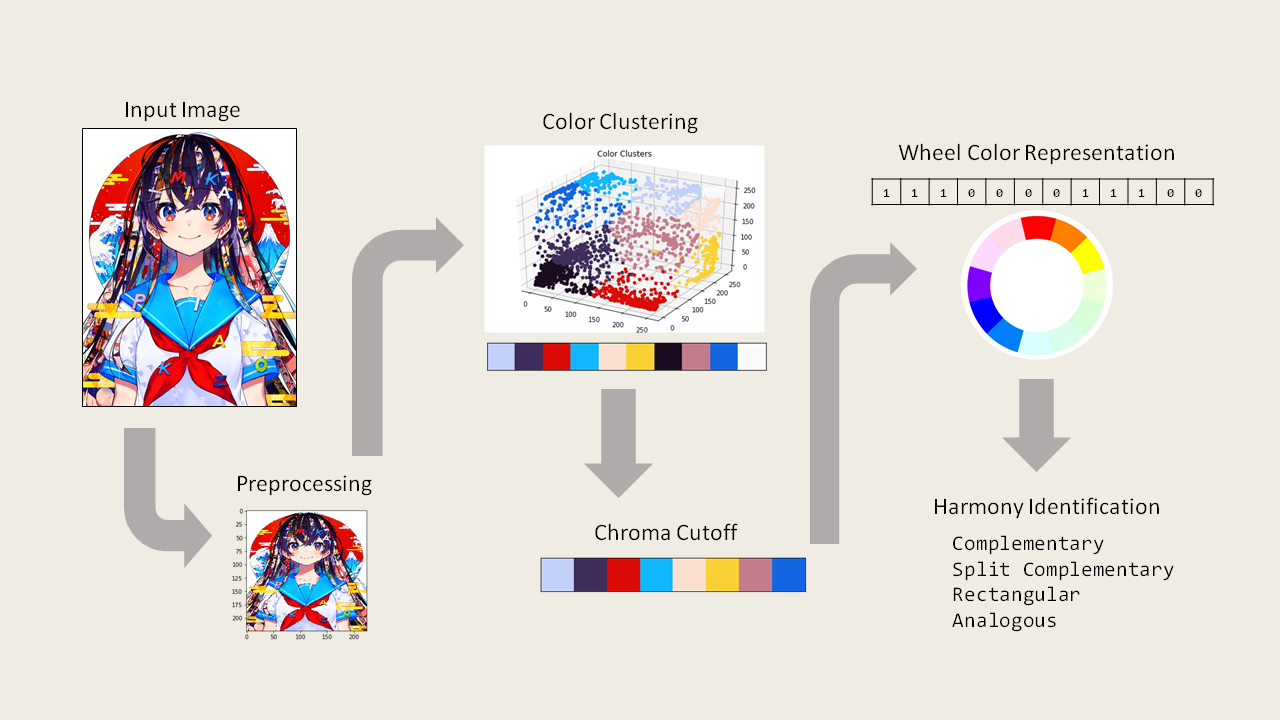
Main Color Extraction
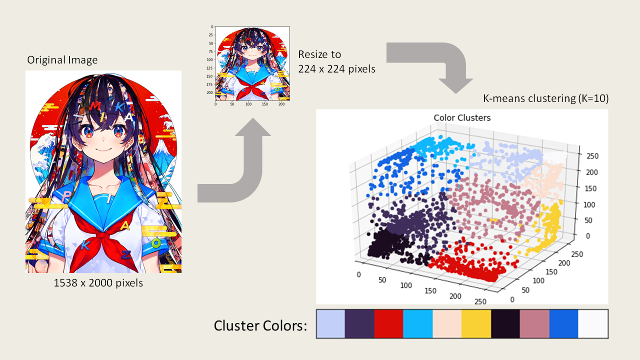
To extract the main colors of an image, we need a method that is able to group similar colors together. One method that achieves this and is commonly used in palette generators is k-means clustering. K-means is a clustering method that minimizes the squared Euclidian distances between data points. We can use this method to group similar colors together in the RGB color space and use the centroids (mean point) to represent each group’s color.
I first preprocessed the images in my dataset by resizing them into smaller images with the same dimensions (224 x 224 pixels) so that they can be easier stored as a numpy array. Resizing the images may cause some boundary pixels to blend with other colors, but the as long as main color areas remain the same color, we will get the same clusters in the end. Resizing images is not required for clustering, but since I’m working with thousands of images, it speeds up process by a significant amount.
A processed image is flatten out into an array of pixels, with each pixel containing 3 values representing its RGB color. We can then plot the pixels in the RGB space to visualize the clusters of colors. Applying k-means clustering with the number of clusters of 10 (images usually don’t have more than 10 main colors) and coloring each cluster by the centroid will give us a clearer view of our color clusters.
For comparison on how k-means performs against other color extraction packages in python, please see the python notebook on my Github repo.
Chroma Cutoff
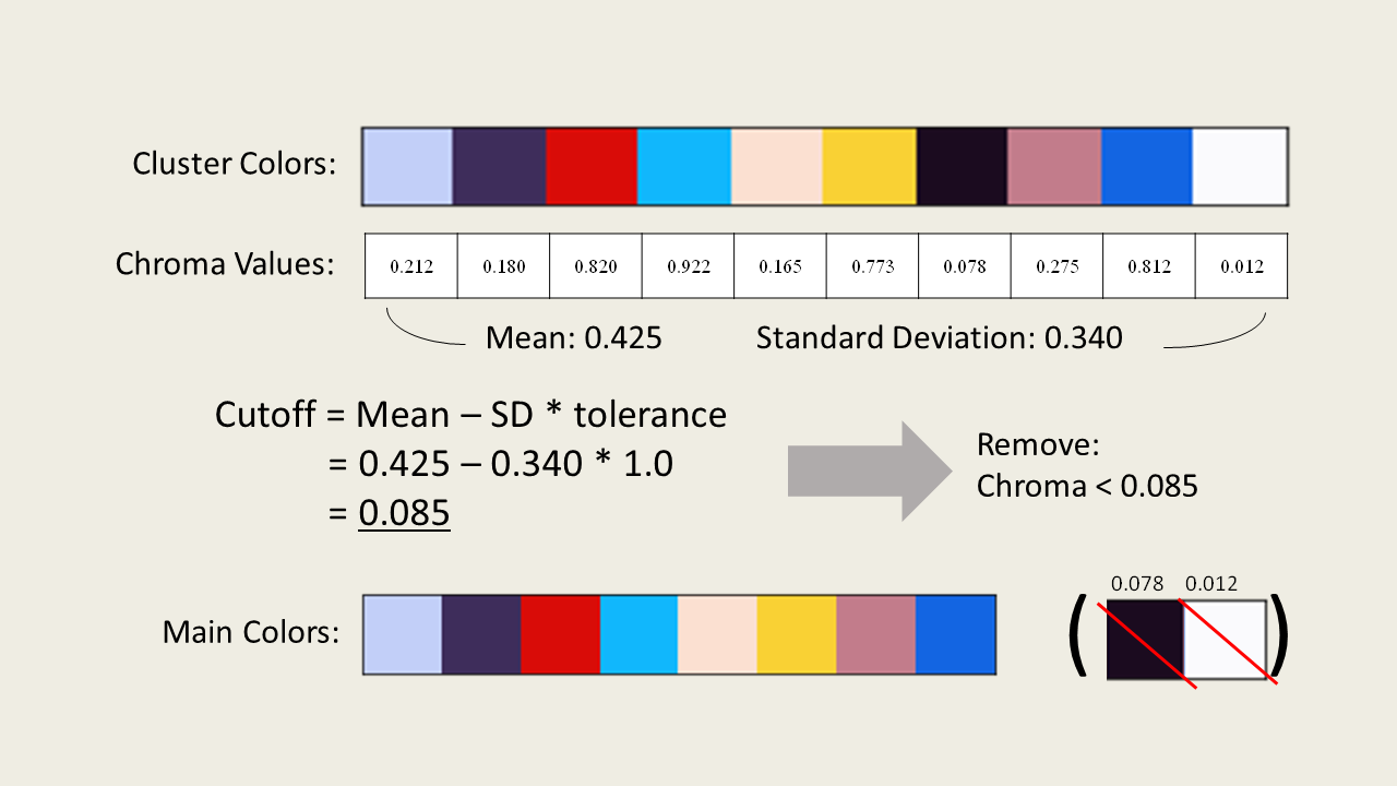
Colors that are almost black or white could cause problems with our harmony identification process; for example, a color that we perceive as white might actually have very small amounts of blue mixed in it but we do not want to consider the image as using the color blue if it appears white. One method we can use to extract the main colors is by setting a chroma cutoff, where we remove the relatively close to black and white colors from our palette based on the average chroma of all the colors.
Recall that chroma can be thought of the purity of a color; high chroma means colorful, low chroma means greyish colors. We can calculate the average chroma of our color palette, then remove those colors that are significantly lower than the mean. This method will remove the relatively black and white colors from our color palette. In this example, I removed the colors that are one standard deviation lower than the mean chroma resulting in the removal of the near black/white colors. The coefficient that determines how many standard deviations down we want to keep our colors can be thought as a tolerance factor.
Color Harmony Identification
After we got our palette of main colors, we can categorize them to the corresponding section on the RGB color wheel by their hues. We split the color wheel into 12 equally spaced slices (because color harmony definitions are based on spitting the color wheel into 3 primary, 3 secondary, and 6 tertiary colors) and specify the representative colors whose range includes our main color hues. If we indicate the presence of a color in binary, we can produce a circular array that represents the main colors in our image.
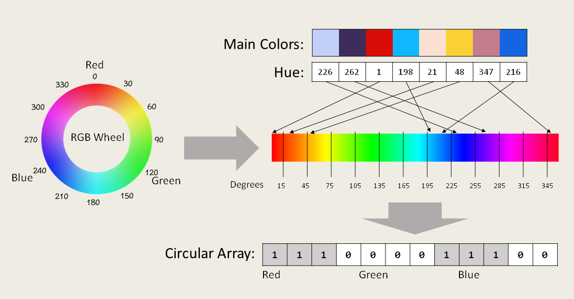
Note that traditionally, color harmony is defined on the RYB (Red-Yellow-Blue) color wheel, but here we are defining color harmonies based on the RGB wheel so the results might be different from our intuition.
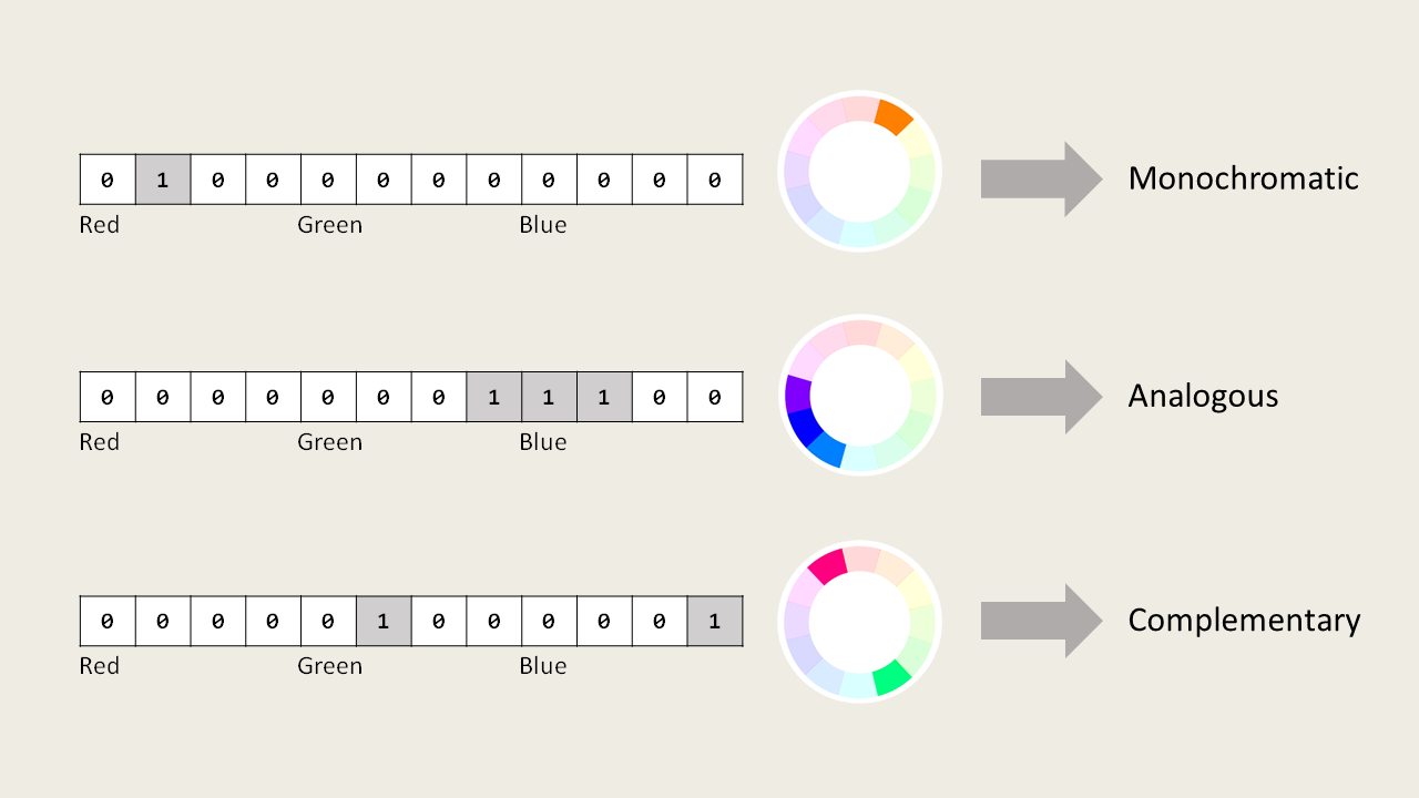
The circular arrays can then be used for identifying color harmonies through writing simple algorithms; for example, a monochromatic image will have only one color in the wheel, so the sum of the elements in the array will be equal to 1. We can also write algorithms to find the presence of nearby or opposite colors on the wheel simply by implementing loops and moduli.
Now we can apply our entire method on different images in our dataset to see how it performs in extracting main colors and identifying color harmonies.
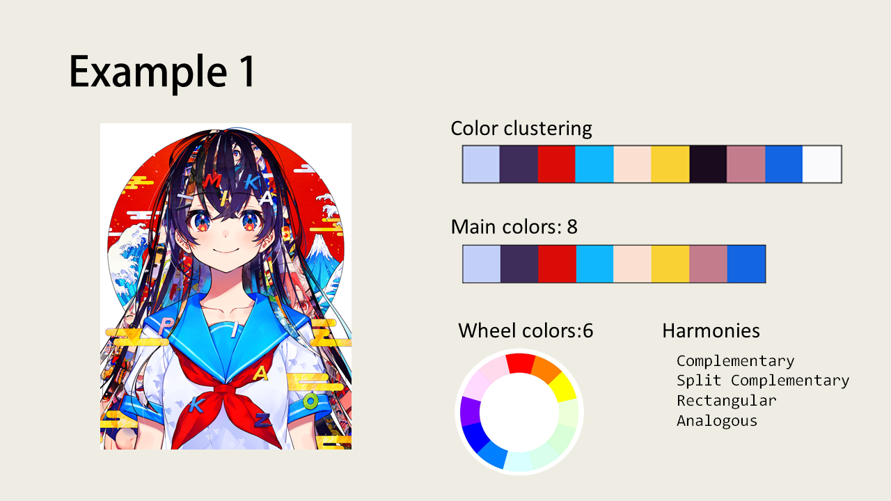
Illustration by Mika Pikazo
If we were to use the RYB color wheel, this image would most likely also be classified as having a “triad” color harmony since it clearly contains the usage of red, yellow, and blue colors.
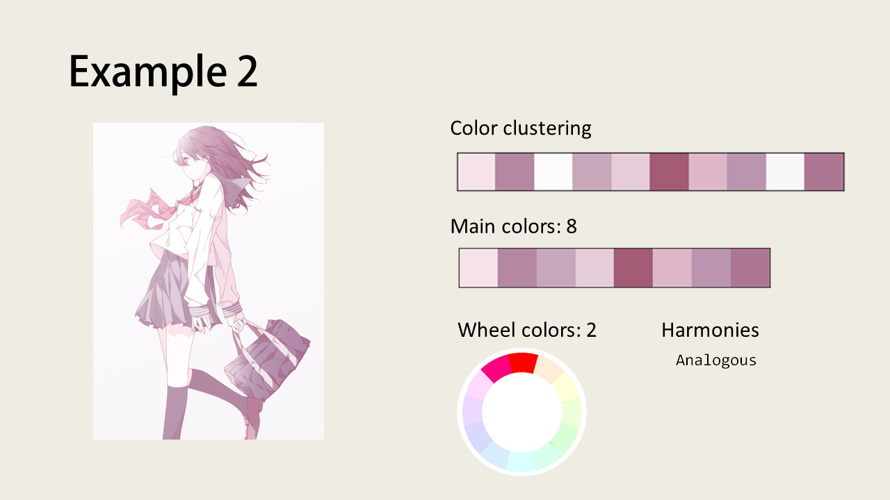
Illustration by shimano
This illustration might look monochromatic at first glance but the colors actually range over two sections of the color wheel.
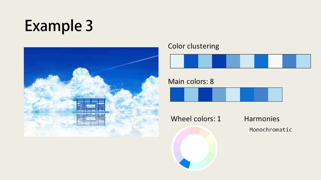
Illustration by 飴村
A prime example of a monochromatic image. Although we have 8 colors in our main palette, they all fall into the same segment of the color wheel.
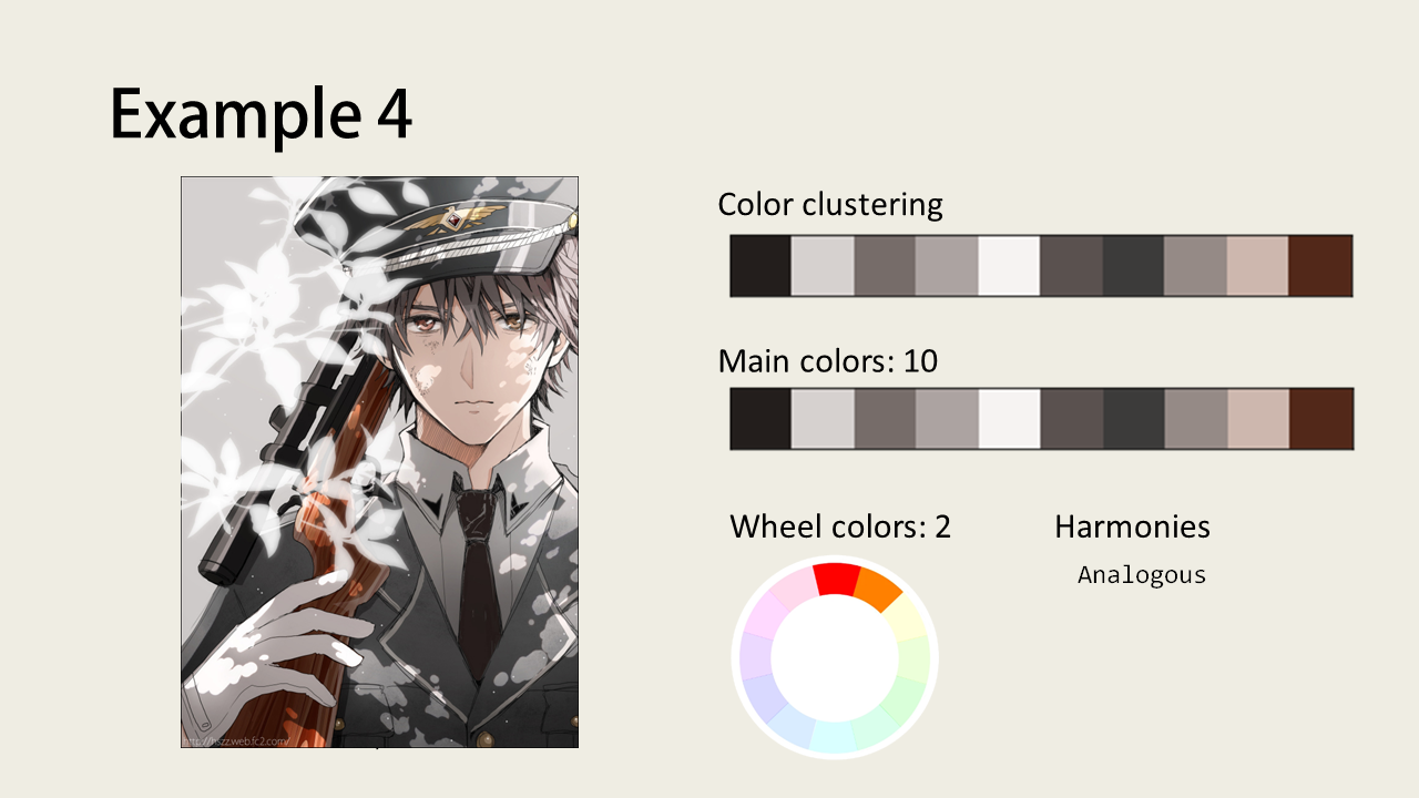
Illustration by hs
This example shows how all the near black/white colors are kept after chroma cutoff because most of the colors in the image are not so vibrant (having low chroma values).
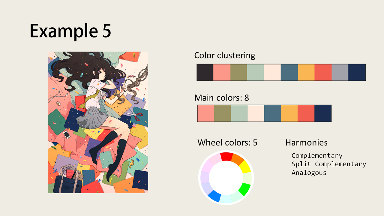
Illustration by けーしん
We can see here that the k-means clustering is really accurate at pulling out flat colors. The chroma cutoff also successfully removes the black and grey colors from our palette.
Illustration by 嗨P
This example shows how our clustering method fails to find the green color of the pole in the middle of the image, possibly due to the relatively low area. A solution to this problem might be to increase the number of clusters (k).
Dataset Color Harmony and Hue Distributions
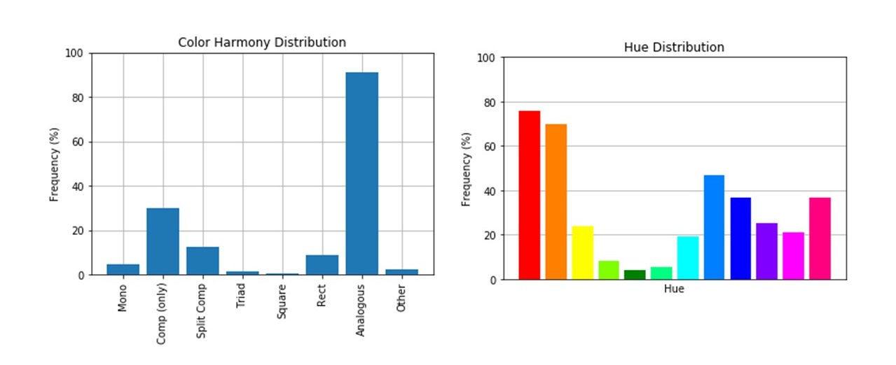
Harmony Distributions
By applying our method to the entire dataset, we can learn which color harmonies are common among the popular illustrations in Pixiv. We immediately see that our dataset consists of about 90% of images with analogous colors. Analogous (neighboring) colors are very easy to use in artwork and gives a pleasant effect.
Hue Distributions
From the array of wheel colors, we can also observe how common each hue range is present in our dataset. Surprisingly, images containing green hues make up less than 10% of all images, while images containing red and orange make up the majority of the dataset. A likely possibility is that red and orange are colors used to color human skin, and most images in Pixiv have human characters in them.
Conclusion
We can summarize this study into the following main points:
- Chroma is advantageous over saturation during analysis because it is not affected by value/brightness.
- We can use k-means clustering with chroma cutoff to accurately extract the main colors from an image.
- Color harmony identification can be done through simple algorithms. No need for a predictive model!
- Most of the popular images on pixiv (our dataset) contains analogous color harmony and there is a common usage of red and orange colors.
Future Work and Improvements
Some further improvements to this study may include:
- Cool and Warm color analysis
- Applying the methodology to the RYB system
- Create an online Demo
Although I haven’t created an online demo for this project yet, I published a python package to PyPI named color-harmony, check it out!
Thank you for reaching the end of this article! I really had fun working on this project as it is also related to my hobby. Hopefully, this article is able to give you some insights or interest on the different ways we can analyze image data. I also plan to work on other projects related to digital illustrations or computer vision in the future whenever I have some free time, so stay tuned!